Free speech for elearning?

This is the second in a series on narration in elearning.

I have a confession to make: I’m a pennypincher. Free stuff is the strange attractor that creates chaos in my office.

Free is not always better. When it comes to computer-generated narration in elearning, free options are not as robust as paid tools or human voice artists, and I rarely use them for finished modules. However, computer-generated narration is a great tool within the elearning development process, and both the Mac™ and Windows™ platforms offer options that work just fine.

0Insert-audio-from-file
Inserting an audio file into Storyline 2

The basic goal is to create an .mp3 or .wav file that you can import into your elearning development project. I use Storyline 2™ by Articulate, which has a simple command for importing files.  So let’s see how to create the files on the Mac and in Windows. We’ll use this sample text:

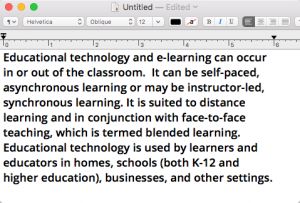
Educational technology and e-learning can occur in or out of the classroom. It can be self-paced, asynchronous learning or may be instructor-led, synchronous learning. It is suited to distance learning and in conjunction with face-to-face teaching, which is termed blended learning. Educational technology is used by learners and educators in homes, schools (both K-12 and higher education), businesses, and other settings.

Mac OS X 10.x (El Capitan)

The first question is probably “Why a Mac, when Storyline 2 operates only in Windows?”

The short answer is that I have a Mac. I have used both Macs and PCs forever, and when it came time to buy my own machine, the Mac just suits my needs and my style better than Windows.

Of course, this presents a challenge with Windows-only products such as Storyline. I meet the challenge by creating a virtual environment on my Mac that allows me to run Windows in a separate window. I’ve tried Boot Camp™, Parallels™, and VirtualBox ™ and currently am happily using Oracle’s VirtualBox to host Windows on my Mac. I can design, create content and graphics on the Mac, and with a few idiosyncrasies, transfer across the two platforms almost seamlessly. VirtualBox is well-supported, and it’s free.

Here’s the three-step process for creating an audio narration file on the Mac. All the applications mentioned are included with the OS X operating system.

  1. Start TextEdit and open the file with the script you want to convert to an audio file. 
    001 original text
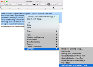
  2. Select the block of text, then right click and choose Services>Add to iTunes as spoken Track.
    02a-set-up-audio-conversion
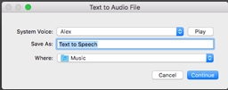
  3. When prompted, select a voice for your file, name and locate the file, then click Save. The file will be saved as mp4a file in the Music folder of your iTunes Music folder. (By default, the file goes to: my name>Music>iTunes>iTunes Music >Music>Unknown Artist >Unknown Album> filename.mp4a)
    03-Save-the-file

From this point there are a couple of things you should do with the file:

  • Listen to it by double-clicking the file. This will open iTunes and play your file.
  • Place the file into your Storyline content folder where it will be available to insert into your project.

Windows 7

And now for the process for creating an audio narration file in Windows 7.

Windows has a built-in TTS feature called Narrator that will read the screen for you, but will not save to an audio file. There’s also the Sound Recorder application, which will record audio and output it to a file. However, I find coordinating these applications to create a narration file is at best awkward. Fortunately there are better options.

One of several free or low-cost applications in this space is Balabolka™. According to the web site, the name means “chatterer” in Russian. This freeware package is easy to download, easy to install, and works smoothly. I used the default settings and achieved good results.

  1. Open Balabolka. You can either paste your script into the window, or open your text file with File>Open.
  2. Select the SAPI5 (Speech API 5) tab to use Microsoft’s built-in speech recognition and synthesis platform. This may be the default tab.
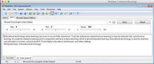
    1a-text-in-Blalbolka
  3. Select your text, then click File>Save AudioFile.
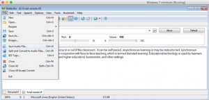
    2a-save-file
  4. The Save As window will open. Name your file, choose a file format, and save the file.
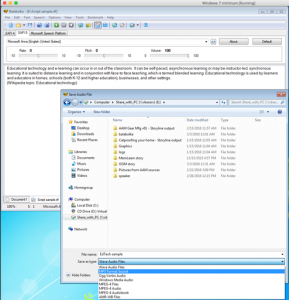
    00W3-Save-file

And now you have the file which you can preview in Windows Media Player or import into Storyline.

If you are so inclined, you can tweak the setups in both systems to change the speed, pitch, voice, or output location of your file. You can also use programs like Audacity™ to edit the file or export it to another format.

None of these techniques will result in high-quality narration, but they do create acceptable draft narration for development work. And they’re free.



Talking about narration

This is the first of a series of posts on computer-generated narration in elearning.

Back at the turn of the century when I was getting started with online training, there was a debate among designers about whether courseware should be seen and not heard. At the time, broadband was not widely available, so the burden of the extra soundtrack on transmission speeds was something to consider. For my client who was sending courses to affiliate stores in twenty states across a 9600 baud dial-up modem, the answer was easy: no audio.people-1099804_1280

Today the bandwidth issues are largely gone, and the discussion is more likely to be when to use narration than if. Based on my experience, there are times for narration and times for silence.

Do use narration when:

  • You have a very short, highly technical lesson for a technical audience. Show the graphic on the screen, and explain the fine points of what they are seeing.
  • You have a highly graphical subject and narration adds to the graphics. An example of this might be a module on filling out a complex form: show the form on the screen and use the narration to explain how to fill it out.
  • You have a moderately complex subject and narration expands on the key points shown on the screen. This could be considered the “SME with PowerPoint™” model – the screen shows the bones of the subject, but it’s the experienced speaker that puts meat on the bones.
  • Your course design allows learners to easily stop and replay audio. This prevents one of my personal pet peeves about online learning, which I call the “YouTube™ effect”: there’s a video teaching a skill you want to learn, but the speaker talks so fast that you have to stop and rewind every few seconds to keep up.  Your course should allow the learner to pause, reflect on the content, and replay the audio as needed to clarify a point.

Do not use narration when:

  • Physical delivery will be an issue. There are still places where bandwidth is not sufficient to support rich media (this goes for video as well as audio).
  • Narration reads the content on the screen. Learners never read and hear content at exactly the same speed, and having the same information coming at two different speeds will cause confusion and reduce learning effectiveness.
  • The client doesn’t want you to include narration. Clients may have any number of reasons for not wanting audio in their elearning, and you have to respect that.

There are a lot of discussion points around narration, but for now let’s just say that there are times you should use it, and times you should not, depending on the content, the audience, and the purpose of the course. But that brings us to the next question: what type of narration? Do you need an expensive voice-over artist to be able to include good narration in your course?

In the last few years, a large number of text-to-speech (TTS) products have appeared that let the computer read a script aloud. These are not new – the Talking Moose™ appeared on the 1986 Macintosh™. But more recent versions do two things the Moose could never do: first, they can capture their narration in a file that can be inserted into an elearning module in products like Storyline™ or Lectora™, and second, they sound roughly like live human beings.

There are dozens of products that include TTS features, and in another post, I’ll review a few of the major ones. TTS is part of both the Mac and Windows operating systems, which would seem to eliminate the need for external applications. However, the built-in applications are limited in the voices you can use. External products such as those by Nuance™, Natural Reader™ and iSpeech™, have a wider range of more naturalistic voices (iPhone’s Siri for example, is in part powered by Nuance technology). Some of them allow you to tweak the output so that it sounds more natural. (By the way, I am not endorsing any of these products, just saying that they exist.)

At the end of the day, none of them are (yet) as good as a human voice. But TTS has a definite place in the online designer’s toolbox. Here are four good uses for low-cost computer voices:

  • Proofing your narration script. No matter how many times you review a script before sending it to the voice-over artist, you will miss something. For me, it’s usually punctuation or pronunciation of an acronym. Listening to a computer generated draft of your script lets you find those places and correct them, saving you time and rework.
  • Timing your narration to the activities on the screen. Animations and page builds of all sorts are more effective when timed to the narration.
  • Reviewing draft courses. When you are building on a budget, this lets you and your clients review the courses before sending the scripts to the voice-over artist. While the effect won’t be as smooth as a human voice, you can get a draft out for review and feedback quickly.
  • Converting screen content into narration for specialized purposes. The most common use for TTS allows sight-impaired or dyslexic learners to “hear” the text on the screen. While technically not the same as voice-over narration, TTS can fill the gap when you provide no other narration.

I want to thank my Storyline user group, who got me to thinking about narration in elearning. Next time, I’ll talk a bit about how to get computer-generated narration for free.

Busting the final myth

I sadly watched the ads over the holidays: Mythbusters, the ever-original Discovery Channel series that used science to explain phenomena of pop culture, was starting its final season the first week of January. For fourteen years, Adam Savage and Jamie Hyneman, the Sherman and Peabody of the popular science world, took us on journeys to explain whether culturally-held beliefs were based on demonstrable facts. Oh, and they blew up a lot of stuff.

homeAt first it was urban myths – the 5-second rule, the question of whether you get wetter walking or running through a rainstorm – but then it developed into something else. The Internet grew along with The Internet grew along with Mythbusters, and viewers invented their own “myths” that frequently involved videos of impossible-looking stunts. Adam and Jamie took us through the story of how such a stunt could actually work. User involvement became a standard part of the program.
And when the myths did work (think Mentos™ and Diet Coke™) they developed and tested various hypotheses for why they worked. In some of their best episodes, they pulled back the curtain of movie or television special effects and showed us how it all happened. In doing so, they made us think.

We do much the same in learning. The most effective learning is a compelling story in which the learner discovers the truth. We show our learners how things work, and sometimes that requires us to bust a few myths along the way. Sometimes we even have to blow up stuff to make our points.

But fourteen years is a long time to do the same thing each week, and Adam and Jamie are ready to move on to something different. I hope you’ll join me in watching the final season of a series that makes you think. I shall miss them.

Building a portfolio – episode 5

Production

Armed with my new template and all my stories, I moved into production on my resume project. Storyline patiently withstood my attempts to revise the master pages after I imported them, as well as my rearranging pages that once stood alone, but now were to become layers within other pages. The thing was coming together.

Along the way, I developed a few standards: the text of clickable buttons changed color when you hovered over them, and the tabs and buttons migrated to their final spots. Had I planned ahead more, those standards would have been in the storyboards. As it was, they were written on small scraps of paper that formed my testing checklist.

On the Friday before I planned to finish the project, I attended my local ATD chapter’s monthly meeting. The program was Building an Online Portfolio, by Mike Taylor. I’ll admit, I was thinking “elearning portfolio” rather than “online portfolio”, but Mike’s tour of tools and website enhancers showed me a number of things I had not used, and probably should get to know better. However, the extensive use of graphics and minimal use of words got me to thinking about what I was building. My first reaction was “do I have to do all this? I’m not really good with graphics, and wait – there are tools to template this? Should I stop and start over again?”

When I got back to the project, I felt a familiar tug: I should take the whole thing apart and redesign it to maximize the use of graphics and minimize the words. My stories were all words, and graphics were more for enhancement rather than the main event.

satan-2I should explain that I get this urge at this same point in about 80% of my projects. Perhaps I become too familiar with the content and can’t see the good in it any more. (Same concept that makes us seek out proofreaders.) Perhaps we don’t want to release something until it’s perfect, which we know it can never be. Whatever the source, the old demon Redesign was upon me, and I stared at the project for some time.

The next day, my stories were still words, and the project was still organized as it had been. The urge had passed. There’s a philosophical point (that perhaps I should explore another day) that most of what I have done and am good at is working with words. The stories reflected that. Graphics are important elements of storytelling (“and what is the use of a book,” thought Alice, “without pictures or conversations?”), but another important element is finishing the project. I was not going to redesign it; I was going to finish it.

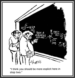
The rest of the work is best illustrated by S. Harris’s classic cartoon. harris-framed After a solid day of copying, pasting, aligning, layering, toggling, and adjusting, the project was ready for testing.

Lessons learned: Fight the urge to take everything apart and put it together again. You’ll never finish, and who will read something that is never finished? Besides, if you’ve been rigorous about defining the goals and design of the project, redesign probably won’t improve it.

Building a portfolio – episode 4

Visual design

Medieval_writing_desk_after
After writing the content

The next step after developing the storyboards and writing the extra content was to create the visual design. I could have gone to Storyline™ at this point, but I stayed with PowerPoint™ for the overall design. Because I was more familiar with PPT than Storyline, and slide masters can be imported from PPT to Storyline, I assumed that I would save a little design time.

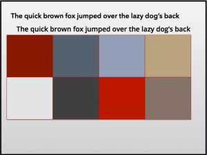
Palette 1
The first palette.

I had already decided on a tabbed design, and wanted to work in the flat design model that has been popular recently. My next step was to pick a color palette. Typically, I am sort of a subdued-color person. While I am not fond of the grey-infused colors I see on a lot of business websites, the highly-saturated crayon-colors used on a number of elearning products is great for learning, but not formal enough to represent me. So I chose a black-red-grey-blue palette  and set about creating a prototype.

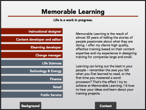
The first splash page

After creating the splash page and a few mockups of interior pages, I asked a friend whose judgment I trust to look them over. She came back with the same concerns I had: too dark, too bland, too wordy, too much text. Back, literally, to the drawing board.

As Oscar Wilde supposedly said, experience is simply the name we give to our mistakes. This time I chose a brighter palette, and simplified everything. The prominent tabs became menus; the bars on the inside pages became buttons.

I imported the redesigned PPT file into Storyline. As those of you who have worked with this program know, importing is quick and easy. The colors transferred flawlessly, as did the master layouts.

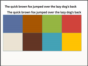
The second palette
The second palette

As part of the redesign, I took the opportunity to revisit the amount of text I had created. By writing in the slide spaces, I was able to keep the stories short and to the point. But as I contemplated reducing the number of pages in the overall project, I wondered whether I had created too many examples. Were the stories redundant? The stories were good, but did they tell a good overall story?

I fortified myself with another glass of iced tea and faced the little stories. Ruthlessly, I pared away stories that had already been told elsewhere, or which didn’t contribute to what I wanted to say.

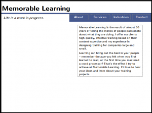
At last!

Finally, I had the design I wanted: four pages, clean and colorful. Navigation was easy, and the stories were on target. I was ready to build the project.

Lesson learned: Even if you don’t consider yourself a graphic designer, trust your intuition on the visuals. If it looks boring, intimidating, or wordy to you, it’ll probably look boring, intimidating and wordy to someone who doesn’t know you as well as you do.


Side note: Did you know that ruthless comes from Middle English, and probably comes from the verb rue, meaning feeling sorrow or regret. Rue is even older, and probably comes from Old English or Old Germanic terms for regret. Today we use the terms rue (usually as a verb), and ruthless (as an adjective), but rarely do we use the positive adjective ruthful, meaning full of empathy for the suffering of others. Source: http://www.word-detective.com/2010/12/ruthless/

Building a portfolio – episode 3

Completing the storyboards

In week 2 of the project, I laid out the goals for my Storyline project and organized the content. This week I am writing the storyboards – the planning documents that show how the project will be constructed.

It’s tempting to think that, once you have structured your content, that you have a design. Had I been developing a course, I would have gone through an extra set of discussions with the SME about the priorities for the content and distilled an outline with specific goals (in the form of key learning points) for each level of the outline. As it was, I succumbed to the temptation to think that all my content structure was equally important, and I plowed ahead.

There are a lot of storyboard templates, but they share common information:

  • Reference number – everyone has a favorite way of numbering screens.
  • Content – the exact text that will go on the screen, identified by areas on the screen.
  • Navigation – These direct the flow of the content, and in addition to the normal Next and Prev buttons, might include branching menus, buttons or sliders for interactions, radio buttons and checkboxes.
  • Graphics and media – audio scripts, reference to graphics, animations, videos, etc. that will be added to the screen. Think of this as your property list.
  • Development notes – everything else you want the developer to know, even if you are developing the project yourself. This is where you can describe everything from color to the interaction on the screen.

Other things I have seen added to storyboards include compliance mapping (mapping the storyboard to the high level design document), review notes, and specialty templates such as quizzes or drag-and-drop interactions. What’s important is that you write down all the information needed for the developer, either in text specifications or by graphically designing each screen.

The storyboard tool you choose depends primarily on you and your project. There are successful storyboards created in word processors (Word), presentation tools (Keynote), diagramming tools (Visio, Twine), and specialized storyboarding tools (Storyboard That, Amazon Storyteller). I chose PowerPoint for a couple of reasons: the ability to lay out the page and write to the space I have, then import directly to Storyline, master pages, color themes, and all.

Bumps in the road

One of the reasons to use PowerPoint was to start working on the visual design. I decided to look at a number of other people’s projects for ideas.

Have I mentioned that I am easily distracted? When I have a deadline, I can focus on a task as well as anyone, but if I am researching a topic, a shiny object that pops up in the search engine can lead me off-topic in a hurry.

So it was when I started to look at other people’s marketing layouts. So many styles to look at! So many ideas! Articulate’s Elearning Heroes community has a ton of such templates that I could download. Goodness galore! I could have spent days looking at them – okay, I did spend a good part of 2 days looking at them. Some of them were so wonderful that I just sat and marveled at them.

But I finally dragged myself out of Google and started to create the template. Because of the tables (see last week’s column) I thought I wanted a tabbed layout, and I had found several projects with interesting ways to set up tabs. I then entered the content into the storyboard template. I’ll skip over the details and upload the first few pages of the storyboard.

I very quickly realized that, because of the way I was presenting the content (services and industry experience), I could not use the standard bullet point descriptions of projects that were in my current resumes. My message was not “I was the instructional designer for these 25 projects”; they were stories about, for example, how my colleagues and I had solved a specific problem for a client by simplifying the design of her course. I needed to rewrite almost all of the stories that would appear in the project.

Medieval_writing_deskAnd that’s when I made my mistake. Because I had not prioritized the content while structuring it, I discovered that I had over 40 stories to write. If anyone else were my client, I would have gone to them and said “This is too much. No one will read that much material, and is it really critical to your message?” But because I was my own client, I ignored my process and plunged ahead to write them all. After all, Scheherazade had told a thousand tales; surely I could write forty.

Will I complete the writing and move on to visual design? Or will I find a way to simplify? Stay tuned!

Do you have a favorite storyboarding template you’d like to share? Send me a link and I’ll add it to a future post!

Building a portfolio – episode 2

I become my client

It’s been about three weeks since I wrote the first episode of this saga, and about a week since I posted it. In the intervening time, I’ve approached the as I would if I were a client. This may complicate the telling of the story.

If I were a client, this is how I would work with me:

  • find out what my goals are, and what I want to accomplish in the project
  • establish the key messages I want to get across and identify my priorities
  • locate and structure the content to create those messages
  • build up storyboards with content (episode 3)
  • design the project for optimal visual impact (episode 4)
  • build and test the project (episodes 5 and 6)
  • launch the final, approved product (episode 6)

So there’s a lot to cover today. Of course, if I were a new client, there would be more I would want to know: sponsorship, communication, company culture, meeting the SMEs, doing a needs analysis, and so forth. But I think I know this client reasonably well.

bulls-eye-transparent My goals are two-fold: improve my skills with Storyline 2™, and create an online portfolio showcasing my skills and experience. The end product will be posted on my web site at www.memorable-learning.com.

Notice that nowhere did I use the term training? Once I recognized that I was creating a marketing piece rather than a training piece, the framework for the project began to appear.


framework

As I put details on my goals, it became clear that I wanted the reader to get four things out of the project:

  1. Understand the services I offer: I am an instructional designer and elearning developer, with deep experience in collecting and structuring content, and in looking at the overall needs of an organization in change.
  2. Walk the path that got me to where I am today: the experience I have had in a variety of industries.
  3. Appreciate a well-crafted Storyline project that tells my stories.
  4. Learn about my background and how to contact me.

That sounds like a pretty firm structure. I am ready to move on to the content.

BookshelfOver time, I have built a lot of resumes, each one either an update of a previous one, or a presentation of a specific set of skills. There was no master document with descriptions of each project I’ve done over the years. Well, there was one – I had started a CV (curriculum vitae, the resume of academe) when I was in grad school, and until a few years ago, I had dutifully added a bullet point about each new project as it was completed. It ran to 12 pages, and had not been updated since 2003.

Have you ever tried to remember everything of note you’ve done in the last 12 years?

Fortunately, I had kept copies of my timesheets for that period (no, I don’t know why I kept them, just never deleted them) so I could identify which projects were done when. I captured these in a small Word template and tried to fill in as much detail as possible. There were 27 projects.

Blue-bridge So back to the structure. I had identified four services: instructional designer, content developer / editor, elearning developer, and change mThe four are interrelated, but there are some specific aspects of each that I wanted to talk about. Once I laid out these topics, my structure began to look like this:

ID Content Elearning Change
Analyzing needs
Defining goals
Designing for best effect
Working with experts
Delivering and coaching
Evaluating outcomes
Multinational experts
Regulated environment
Technologists
Thought leaders
Public service experts
Blended curricula
Repurposing to elearning
Regulated environment
Dedicated elearns
Virtual classrooms
Change strategy
Needs analysis
Communication planning
Teaming for success
Workforce alignment
Change training

And the same analysis for the experience in industries yielded this table:

Life Sciences Technology Finance Retail Public Service
Scientist
Process alignment
Risk management
Change strategy
Technology
Training new processes
Distributing expert knowledge
Enabling public utilities
Training custom systems
Enabling across divisions
Merging accounts payable
Training IM auditors
Training bank auditors
Implementing financial ERP
Automating advertising
Restaurant financials
Transformed stores
Cosmetics supply chain
Retail consultant training
County government
Federal change managers
Federal consultants

It’s still a lot of topics, and I had to write a short description of each of them.  More on that next week.

Lesson learned: Never throw away anything. You might need it some day.

Building a portfolio – episode 1

empty portfolioI’ve been building elearning products for clients since 1999, and what do I have to show for it? Lots of proprietary notes and drafts, and precious little in the way of samples that I can show potential clients.

Mind you, I’m not complaining. Until recently, I worked for large organizations where I could point to other projects for the same company as my portfolio. Because these large firms generally held that their information was proprietary (and the fact that most final products were stored on secure course management systems), I could not take any of my finished work with me when the project was completed.

But now I am on my own again, and trying to increase my elearning business. For that I need a portfolio. Some things are fairly easy: I’ve kept written descriptions of most of the projects I did over the years, so I have the raw materials for case studies and resumes. Templates for some of the work, like stakeholder analyses and user guides, can be made into vanilla forms and checklists. But finished courses, especially elearning modules, are a different matter. Those I must create from scratch.

Over the next few weeks, I will be documenting the steps to creating an elearning portfolio from personal experience. I’ve read a number of helpful websites and blogs, but at the end of the day, it’s down to me to build it (and hope that, having built it, they will come). So stay tuned for new adventures in learning.

The first step is probably the hardest: deciding what to build.

The sample should be relatively small (a short module or two, maybe a quiz), and I should be able to create a complete package showing the process from initial thought process to final output. Check.
I am fluent in three elearning tools (Lectora, Articulate, and, to a lesser degree, Storyline 2), so to cover all bases, I could create a sample in each of them (I’ll address my adventures with these programs another day).

Now all I am missing is the content – what will the modules be about?

At first I thought, “perhaps some side issue with my latest project?” I’m just completed on a series of virtual classroom sessions tangentially involved with Common Core standards for schools, so I thought perhaps a short history of Common Core might be interesting. Did some research, and maybe that will become one of the new modules.

Then I got to thinking about other projects might lend themselves a short, interactive, colorful, interesting elearn. Lots of things there. But perhaps the most critical thing was updating my resume. Now there’s an idea: encapsulating my past so that I could pull it up for interviews. Let’s see where that goes.

Stay tuned for the next episode: high level design and storyboards.

Training the invisible person

Regardless whether you subscribe to ADDIE, SAM, Kemp, rapid prototyping, or all-of-the-above instructional design methodologies, you probably approach a new training project the same way: who is the audience, and what are their needs? But what do you do when your audience is invisible – either too large and diverse to adequately characterize, or unavailable to you?

No, that cannot happen, you say. Modern training is targeted to the specific needs of our audience. Really? What about the company who has been training the same group of people for 10 years, updating their training every year for new technology, but never checking to see whether their people have changed? Or the development firm developing or updating a system for another client, giving you (the subcontractor) no access to the ultimate audience? Or maybe, just maybe, you find yourself working with an IT department head who says (as a client of mine a few years back did) “the users will take whatever we give them”.

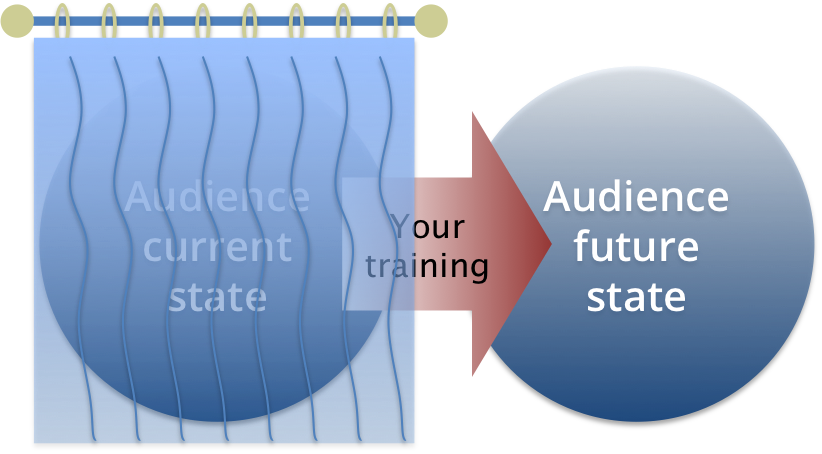
We all know why we do audience analyses. Learning is more effective when it is targeted to the needs, preferences, and capabilities of those being trained. By learning who the primary and secondary audience(s) are, what their demographics look like, how much they already know about the subject being trained, how they are most effectively taught, their technology experience, and their expectations about the training, we can make a picture of the “current state” of the audience.

We then create the “future state snapshot” – what the audience should look like if your training is successful – from the project vision and requirements. The difference between the two is the change you are training. Regardless whether it’s an updated computer system, new processes, or a wholesale reorganization of the enterprise, it’s always a change.

But sometimes all you have is the future state. Think about the last software you got from Microsoft, Oracle, or Apple. Their training has to be adequate for anybody, anywhere. The only common denominator is that they have MS-Word (for example) and have to know how to use it. Now we’re in the world of training the invisible person.

Is it important? Commercial product companies make assumptions about their products all the time. Yet when someone is making the investment in training, hitting the wrong mark can be costly and even counter-productive.

The truth is that even when you have no direct access to the audience, information is not completely unavailable:

  • Read any background material you can lay your hands on (specs, scoping documents, strategy documents, etc.). Sometimes someone has done a stakeholder analysis or made a list of assumptions about the audience.
  • Identify assumptions made about the project. Why the change is needed tells you something about how things are now. And it will tell you a whole lot about the expectations for the future.
  • Review the results of the last big change made. What went right, and what went wrong? What can you learn about your audience from this?
  • Look for larger trends. For example, 10 years ago, a 3rd-year accountant would have been spending a lot of time supervising the actions of younger accountants, who were collecting and categorizing information. Today, many large accounting firms outsource this first step, so the 3rd-year and younger accountants are doing more analytical work, and need to be trained accordingly.
  • Talk to your team. They may be more helpful than you expect.

With imperfect data about the audience and its needs, you can still create excellent training. The key is to emphasize what you do know, not what you don’t know.

  • Establish a voice and an image. Create a mental image of your audience or user, and keep that image in mind while you’re designing. It may at first be a hazy image, but use it to guide your work.
  • Be consistent. Your audience image may be hazy, but you need to write as though that audience were reviewing your every word.
  • Work backwards from your known future state to establish principles and competencies. When you don’t know what your audience has, figure out what they need, and apologize to those who already have it. Even experts need to brush up on skills occasionally, and when you find you have such an expert, turn them into an ally who can reinforce (or even help deliver) the training.
  • Keep it simple.

So even if you cannot do a formal audience needs analysis, you can successfully create training. What tips do you have for training the invisible audience? Share them with us in the comments, and happy training!

MOOCs

In many ways, MOOCs (massively open online courses) are not new. When introduced in 2008, they were seen as extensions of the existing distance learning model (which itself had evolved from correspondence to radio to closed-circuit television broadcasts) to the internet. But then it became something else: a way to extend the university itself to anyone in the world with an internet connection.

The idea was tried by many universities over the next few years, and became wildly popular when it teamed up with the OER (open educational resources) movement, which added the idea that the MOOC should be free for anyone to take. In 2011 the first MOOC organizations (Udacity, Coursera) appeared. In 2012, the New York Times declared the Year of the MOOC, and one year later, the Times declared MOOCs to be failures. But not everyone agrees with the Times. In December 2014, an MIT Technology Review article asked What are MOOCs good for? . So who’s right? Are MOOCs a superior educational experience that allows the students to learn from the best instructors, or just another over-enthusiastic technology application?

I’ve taken several courses through Coursera, one of the major MOOC platforms, and have heard many of the standard complaints. Non-completion rates as high as 96% wasted the time of serious students. Instructors who acted as though their university were forcing them to make their courses available to the unwashed masses, and instructors who did not seem to acknowledge that anyone was outside their classrooms at all. Assignments made on the premise that the student had no responsibilities other than the course (honestly, 8 short stories and 2 novels in one week?).

But I’ve also seen some genuine innovation in teaching: science courses that brought current field research into class in an easy and seamless way, and comparative literature taught through video games. So are MOOCs really a failed form, or can we learn from these issues to continue this experiment in genuine adult education?

The first rule of communication is “know thy audience”, and this is where I believe many MOOCs have disappointed. When first proposed, MOOCs were intended to provide college-level courses to the masses for free. I won’t comment on the “for free” part, because while producing a MOOC isn’t free, the business model that allows students to take the courses is still very much unresolved.

Once a MOOC is released into the wild, however, anyone and everyone can sign up for it. The model intended for college students becomes a learning resource for everyone. This has led to some interesting, although probably predictable, results. Huge numbers of people sign up for courses, but those who complete the course (the common measure of success) are typically self-motivated, interactive, diligent, and disciplined. So in one respect, the initial audience analysis for MOOCs is spot-on: successful students are those who would be successful on-campus college students. But who are the rest of the audience, and why are they not successful?

Well, most of them are adult learners. The difference between the two is a matter of focus and experience: adult learners generally have more experience to draw upon, and less time to focus on learning than the traditional 18-22 year old college student. Adult learners may not be looking for a college credential – they may be looking for a resource or to learn something interesting and new. Non-native language speakers may be looking for a way to practice English composition (this was the case in the literature courses). Others take courses to try out new skills and career options. So for these learners, the credential is not the goal – it’s the content. But the content is not organized for those audiences.

Other people simply may not learn well in the traditional academic structure. Maybe they are night owls, or learn experientially rather than by reading or listening. They may succeed in learning the content, but fail at the course. The content is in most cases not organized for those audiences either.

Still others do not have the time to devote to a traditional course (the literature course that took 15+ hours a week). For them the traditional structure may be appropriate, but not the deadlines.

The basic idea of the MOOC is a good one – providing access to learning for everyone. However, developing courses with audiences other than the college student in mind will make it more successful. Here are my suggestions, for what they are worth.

Keep the college courses.
Even if it’s only 4% of the total population, traditional college students are an important audience for MOOCs, and will help universities broaden their total audience.

Develop for adult learners. Designing for adult learners is different from designing for college students, but it will be worth the effort to address the audience of non-degree-seeking learners.

Hands-on and group learning. Some audiences require group discussion and / or hands-on projects to complete in order to master a subject. Book club members already understand this concept, and a growing number of researchers are finding that science is often better when people share data and discuss findings.

Abolish the semester. To address the student’s lack of time, courses could be offered with a six-month or one-year deadline instead of the typical 10-12 weeks. This is tougher than it appears, as the support system for a MOOC includes interacting with instructors and facilitators who would be bound to a longer time commitment.

Describe the approach in the catalog. Let your audience know how the course is designed and they can choose for themselves. MOOCs have been accused of being one-size-fits-all, but I’ve found that much of that reputation comes from placing existing classroom courses, sometimes unaltered, into the structure of the MOOC platform. Yet within that structure many find ways to provide innovative learning techniques. Describe the intended audience for the course along with the content and let the learner decide.

The good news is that most of these suggestions are being tried. A recent report from Columbia University discusses the proliferation of various forms of the MOOC, and in a later posting, I’d like to start a discussion on the merits of xMOOCs, cMOOCs, and corporate MOOCs. But that’s a tale for another day. The success of Coursera, Udacity, and other similar open knowledge resources suggests that the form is evolving as practitioners continue on the grand experiment. My prediction: there will be many types of MOOCS, addressing the needs of learners throughout their lifetimes. Stay tuned!