Visual design

The next step after developing the storyboards and writing the extra content was to create the visual design. I could have gone to Storyline™ at this point, but I stayed with PowerPoint™ for the overall design. Because I was more familiar with PPT than Storyline, and slide masters can be imported from PPT to Storyline, I assumed that I would save a little design time.

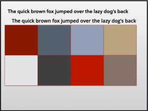
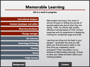
I had already decided on a tabbed design, and wanted to work in the flat design model that has been popular recently. My next step was to pick a color palette. Typically, I am sort of a subdued-color person. While I am not fond of the grey-infused colors I see on a lot of business websites, the highly-saturated crayon-colors used on a number of elearning products is great for learning, but not formal enough to represent me. So I chose a black-red-grey-blue palette and set about creating a prototype.

After creating the splash page and a few mockups of interior pages, I asked a friend whose judgment I trust to look them over. She came back with the same concerns I had: too dark, too bland, too wordy, too much text. Back, literally, to the drawing board.
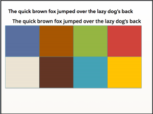
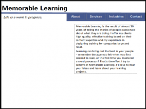
As Oscar Wilde supposedly said, experience is simply the name we give to our mistakes. This time I chose a brighter palette, and simplified everything. The prominent tabs became menus; the bars on the inside pages became buttons.
I imported the redesigned PPT file into Storyline. As those of you who have worked with this program know, importing is quick and easy. The colors transferred flawlessly, as did the master layouts.

As part of the redesign, I took the opportunity to revisit the amount of text I had created. By writing in the slide spaces, I was able to keep the stories short and to the point. But as I contemplated reducing the number of pages in the overall project, I wondered whether I had created too many examples. Were the stories redundant? The stories were good, but did they tell a good overall story?
I fortified myself with another glass of iced tea and faced the little stories. Ruthlessly, I pared away stories that had already been told elsewhere, or which didn’t contribute to what I wanted to say.

Finally, I had the design I wanted: four pages, clean and colorful. Navigation was easy, and the stories were on target. I was ready to build the project.
Lesson learned: Even if you don’t consider yourself a graphic designer, trust your intuition on the visuals. If it looks boring, intimidating, or wordy to you, it’ll probably look boring, intimidating and wordy to someone who doesn’t know you as well as you do.
Side note: Did you know that ruthless comes from Middle English, and probably comes from the verb rue, meaning feeling sorrow or regret. Rue is even older, and probably comes from Old English or Old Germanic terms for regret. Today we use the terms rue (usually as a verb), and ruthless (as an adjective), but rarely do we use the positive adjective ruthful, meaning full of empathy for the suffering of others. Source: http://www.word-detective.com/2010/12/ruthless/