Building a portfolio – episode 5

Production

Armed with my new template and all my stories, I moved into production on my resume project. Storyline patiently withstood my attempts to revise the master pages after I imported them, as well as my rearranging pages that once stood alone, but now were to become layers within other pages. The thing was coming together.

Along the way, I developed a few standards: the text of clickable buttons changed color when you hovered over them, and the tabs and buttons migrated to their final spots. Had I planned ahead more, those standards would have been in the storyboards. As it was, they were written on small scraps of paper that formed my testing checklist.

On the Friday before I planned to finish the project, I attended my local ATD chapter’s monthly meeting. The program was Building an Online Portfolio, by Mike Taylor. I’ll admit, I was thinking “elearning portfolio” rather than “online portfolio”, but Mike’s tour of tools and website enhancers showed me a number of things I had not used, and probably should get to know better. However, the extensive use of graphics and minimal use of words got me to thinking about what I was building. My first reaction was “do I have to do all this? I’m not really good with graphics, and wait – there are tools to template this? Should I stop and start over again?”

When I got back to the project, I felt a familiar tug: I should take the whole thing apart and redesign it to maximize the use of graphics and minimize the words. My stories were all words, and graphics were more for enhancement rather than the main event.

satan-2I should explain that I get this urge at this same point in about 80% of my projects. Perhaps I become too familiar with the content and can’t see the good in it any more. (Same concept that makes us seek out proofreaders.) Perhaps we don’t want to release something until it’s perfect, which we know it can never be. Whatever the source, the old demon Redesign was upon me, and I stared at the project for some time.

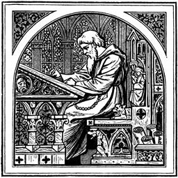
The next day, my stories were still words, and the project was still organized as it had been. The urge had passed. There’s a philosophical point (that perhaps I should explore another day) that most of what I have done and am good at is working with words. The stories reflected that. Graphics are important elements of storytelling (“and what is the use of a book,” thought Alice, “without pictures or conversations?”), but another important element is finishing the project. I was not going to redesign it; I was going to finish it.

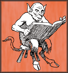
The rest of the work is best illustrated by S. Harris’s classic cartoon. harris-framed 
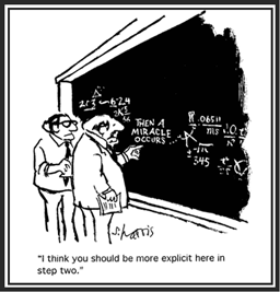
After a solid day of copying, pasting, aligning, layering, toggling, and adjusting, the project was ready for testing.

Lessons learned: Fight the urge to take everything apart and put it together again. You’ll never finish, and who will read something that is never finished? Besides, if you’ve been rigorous about defining the goals and design of the project, redesign probably won’t improve it.

Building a portfolio – episode 4

Visual design

Medieval_writing_desk_after
After writing the content

The next step after developing the storyboards and writing the extra content was to create the visual design. I could have gone to Storyline™ at this point, but I stayed with PowerPoint™ for the overall design. Because I was more familiar with PPT than Storyline, and slide masters can be imported from PPT to Storyline, I assumed that I would save a little design time.

Palette 1
The first palette.

I had already decided on a tabbed design, and wanted to work in the flat design model that has been popular recently. My next step was to pick a color palette. Typically, I am sort of a subdued-color person. While I am not fond of the grey-infused colors I see on a lot of business websites, the highly-saturated crayon-colors used on a number of elearning products is great for learning, but not formal enough to represent me. So I chose a black-red-grey-blue palette  and set about creating a prototype.

The first splash page

After creating the splash page and a few mockups of interior pages, I asked a friend whose judgment I trust to look them over. She came back with the same concerns I had: too dark, too bland, too wordy, too much text. Back, literally, to the drawing board.

As Oscar Wilde supposedly said, experience is simply the name we give to our mistakes. This time I chose a brighter palette, and simplified everything. The prominent tabs became menus; the bars on the inside pages became buttons.

I imported the redesigned PPT file into Storyline. As those of you who have worked with this program know, importing is quick and easy. The colors transferred flawlessly, as did the master layouts.

The second palette
The second palette

As part of the redesign, I took the opportunity to revisit the amount of text I had created. By writing in the slide spaces, I was able to keep the stories short and to the point. But as I contemplated reducing the number of pages in the overall project, I wondered whether I had created too many examples. Were the stories redundant? The stories were good, but did they tell a good overall story?

I fortified myself with another glass of iced tea and faced the little stories. Ruthlessly, I pared away stories that had already been told elsewhere, or which didn’t contribute to what I wanted to say.

At last!

Finally, I had the design I wanted: four pages, clean and colorful. Navigation was easy, and the stories were on target. I was ready to build the project.

Lesson learned: Even if you don’t consider yourself a graphic designer, trust your intuition on the visuals. If it looks boring, intimidating, or wordy to you, it’ll probably look boring, intimidating and wordy to someone who doesn’t know you as well as you do.


Side note: Did you know that ruthless comes from Middle English, and probably comes from the verb rue, meaning feeling sorrow or regret. Rue is even older, and probably comes from Old English or Old Germanic terms for regret. Today we use the terms rue (usually as a verb), and ruthless (as an adjective), but rarely do we use the positive adjective ruthful, meaning full of empathy for the suffering of others. Source: http://www.word-detective.com/2010/12/ruthless/

Building a portfolio – episode 3

Completing the storyboards

In week 2 of the project, I laid out the goals for my Storyline project and organized the content. This week I am writing the storyboards – the planning documents that show how the project will be constructed.

It’s tempting to think that, once you have structured your content, that you have a design. Had I been developing a course, I would have gone through an extra set of discussions with the SME about the priorities for the content and distilled an outline with specific goals (in the form of key learning points) for each level of the outline. As it was, I succumbed to the temptation to think that all my content structure was equally important, and I plowed ahead.

There are a lot of storyboard templates, but they share common information:

  • Reference number – everyone has a favorite way of numbering screens.
  • Content – the exact text that will go on the screen, identified by areas on the screen.
  • Navigation – These direct the flow of the content, and in addition to the normal Next and Prev buttons, might include branching menus, buttons or sliders for interactions, radio buttons and checkboxes.
  • Graphics and media – audio scripts, reference to graphics, animations, videos, etc. that will be added to the screen. Think of this as your property list.
  • Development notes – everything else you want the developer to know, even if you are developing the project yourself. This is where you can describe everything from color to the interaction on the screen.

Other things I have seen added to storyboards include compliance mapping (mapping the storyboard to the high level design document), review notes, and specialty templates such as quizzes or drag-and-drop interactions. What’s important is that you write down all the information needed for the developer, either in text specifications or by graphically designing each screen.

The storyboard tool you choose depends primarily on you and your project. There are successful storyboards created in word processors (Word), presentation tools (Keynote), diagramming tools (Visio, Twine), and specialized storyboarding tools (Storyboard That, Amazon Storyteller). I chose PowerPoint for a couple of reasons: the ability to lay out the page and write to the space I have, then import directly to Storyline, master pages, color themes, and all.

Bumps in the road

One of the reasons to use PowerPoint was to start working on the visual design. I decided to look at a number of other people’s projects for ideas.

Have I mentioned that I am easily distracted? When I have a deadline, I can focus on a task as well as anyone, but if I am researching a topic, a shiny object that pops up in the search engine can lead me off-topic in a hurry.

So it was when I started to look at other people’s marketing layouts. So many styles to look at! So many ideas! Articulate’s Elearning Heroes community has a ton of such templates that I could download. Goodness galore! I could have spent days looking at them – okay, I did spend a good part of 2 days looking at them. Some of them were so wonderful that I just sat and marveled at them.

But I finally dragged myself out of Google and started to create the template. Because of the tables (see last week’s column) I thought I wanted a tabbed layout, and I had found several projects with interesting ways to set up tabs. I then entered the content into the storyboard template. I’ll skip over the details and upload the first few pages of the storyboard.

I very quickly realized that, because of the way I was presenting the content (services and industry experience), I could not use the standard bullet point descriptions of projects that were in my current resumes. My message was not “I was the instructional designer for these 25 projects”; they were stories about, for example, how my colleagues and I had solved a specific problem for a client by simplifying the design of her course. I needed to rewrite almost all of the stories that would appear in the project.

Medieval_writing_deskAnd that’s when I made my mistake. Because I had not prioritized the content while structuring it, I discovered that I had over 40 stories to write. If anyone else were my client, I would have gone to them and said “This is too much. No one will read that much material, and is it really critical to your message?” But because I was my own client, I ignored my process and plunged ahead to write them all. After all, Scheherazade had told a thousand tales; surely I could write forty.

Will I complete the writing and move on to visual design? Or will I find a way to simplify? Stay tuned!

Do you have a favorite storyboarding template you’d like to share? Send me a link and I’ll add it to a future post!

Building a portfolio – episode 1

empty portfolioI’ve been building elearning products for clients since 1999, and what do I have to show for it? Lots of proprietary notes and drafts, and precious little in the way of samples that I can show potential clients.

Mind you, I’m not complaining. Until recently, I worked for large organizations where I could point to other projects for the same company as my portfolio. Because these large firms generally held that their information was proprietary (and the fact that most final products were stored on secure course management systems), I could not take any of my finished work with me when the project was completed.

But now I am on my own again, and trying to increase my elearning business. For that I need a portfolio. Some things are fairly easy: I’ve kept written descriptions of most of the projects I did over the years, so I have the raw materials for case studies and resumes. Templates for some of the work, like stakeholder analyses and user guides, can be made into vanilla forms and checklists. But finished courses, especially elearning modules, are a different matter. Those I must create from scratch.

Over the next few weeks, I will be documenting the steps to creating an elearning portfolio from personal experience. I’ve read a number of helpful websites and blogs, but at the end of the day, it’s down to me to build it (and hope that, having built it, they will come). So stay tuned for new adventures in learning.

The first step is probably the hardest: deciding what to build.

The sample should be relatively small (a short module or two, maybe a quiz), and I should be able to create a complete package showing the process from initial thought process to final output. Check.
I am fluent in three elearning tools (Lectora, Articulate, and, to a lesser degree, Storyline 2), so to cover all bases, I could create a sample in each of them (I’ll address my adventures with these programs another day).

Now all I am missing is the content – what will the modules be about?

At first I thought, “perhaps some side issue with my latest project?” I’m just completed on a series of virtual classroom sessions tangentially involved with Common Core standards for schools, so I thought perhaps a short history of Common Core might be interesting. Did some research, and maybe that will become one of the new modules.

Then I got to thinking about other projects might lend themselves a short, interactive, colorful, interesting elearn. Lots of things there. But perhaps the most critical thing was updating my resume. Now there’s an idea: encapsulating my past so that I could pull it up for interviews. Let’s see where that goes.

Stay tuned for the next episode: high level design and storyboards.

Great expectations

I’ve intended to put up a web site for Memorable Learning for a couple of years now, and today is the day I finally do it. Procrastination is not ultimately a satisfying process.

Memorable Learning is me: writer, instructional designer, technology adopter, cooking enthusiast, and curious storyteller.  In this site I hope to share some of what I’ve learned in more than a half-century of observation and also my latest efforts to master the task at hand.  Once I figure out what goes where on this web site template, that is.